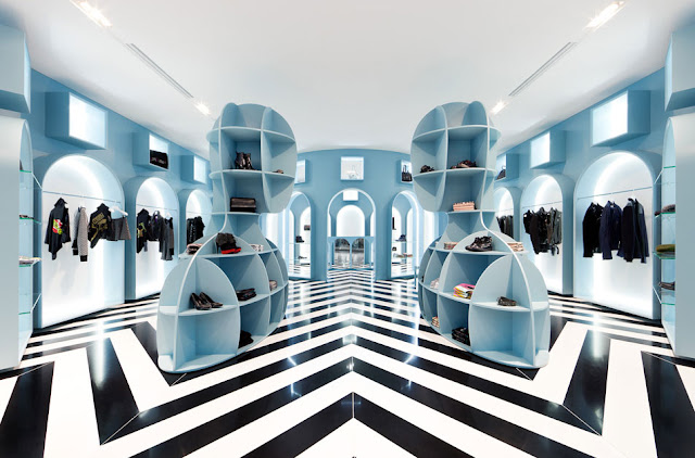
Retail Interior Design | HITGallery store | Hong Kong | Interior Studio Novembre
The HITGallery stores capture the essence and spirit of Italy in wonderful new ways. Taking inspiration from the paintings of Giorgio De Chirico, from the surreal atmospheres he created through the distortion of perspectives, we developed open squares “Italian piazza mode” where we can meet and gather to fathom the enigmas of our existence and to ideally rethink Italy’s role and effective identity in the contemporary world.
Upon entering the concept store in Hong Kong, people will promptly notice the strong Italian imprint of the architectural design’s classical matrix: symmetrical structure, row of arches, one dominant hue offset by two tone flooring.
The color defining the walls “a neutral shade bordering between green and sky or cerulean blue” defies classification, so becoming the ideal backdrop for all the brands sold in the store.......more about the store interior design


